Behind the Scenes of Party Pack 10: Art Edition!
If we didn’t have artists, our games would just be a notes app full of joke ideas. Thankfully, we have a team of talented artists and illustrators who bring our characters to life and give all of the games their memorable looks.
A video game artist is responsible for working with the team to find the best look to complement the ethos of each game. That look needs to both be striking enough to make the game stand out visually, without distracting from the gameplay. Often visual cues are used to indicate to a player where to go or what to do and the look of the game can make or break how accessible it is for disabled players or inexperienced gamers.
A lot of thought goes into designing the look of a game that isn’t just making things look pretty. Even though sometimes, the designers do get to make the prettiest thing imaginable. . .
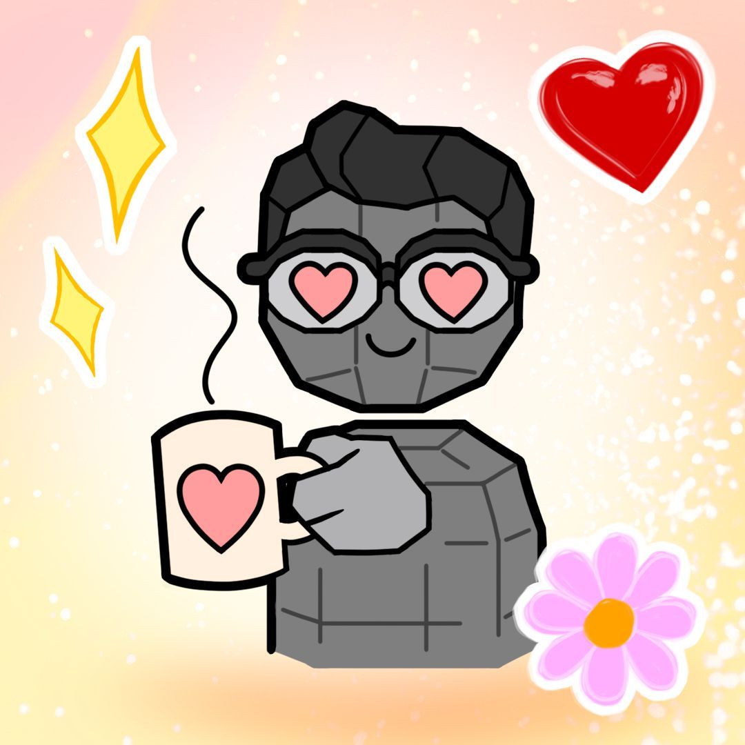
Gene by Rachel Lewis.
We spoke to a few members of the art team on what went into making the art for Party Pack 10.
What was your role on PP10? And what is your title overall at Jackbox?
Bruno Rodríguez: I was the Lead Artist for Fixytext, I made the visuals and animations for that game and its controller (what you see on your phone).
Kyle Fleischer: I'm a Lead Artist at Jackbox, and worked on the visuals for Dodo Re Mi.
Stef Egan: I am currently a lead artist at Jackbox Games, and TimeJinx was an exciting project for me as it was the first game I led the art direction on.
Hero Paul See: I was a Game Artist on PP10! And I am a Digital Artist at Jackbox Games (doing art and animation!)
Owen Watson: Art Lead-Art Director [on Hypnotorious]
How did you approach the look of your game? Did it evolve much from original concept to final product?
Bruno Rodríguez: For Fixytext we wanted a theme around malfunctioning machines. At some point I thought ASCII art could be interesting since it was a game about text. I didn't love the early results so I went for a hybrid approach where strange characters (symbols) would appear on a number of surfaces to create a texture, or faces in the case of the avatars. The straightforward technical drawing look allowed me to mix together hand drawn and rendered objects which is very freeing and more expressive.
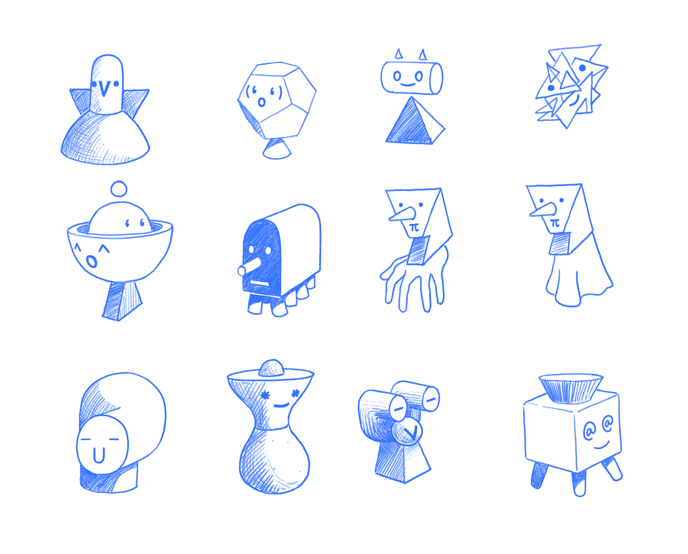
Early style exploration for FixyText by Bruno Rodríguez.
Kyle Fleischer: I try to tie the visuals of a Party Pack game to its mechanics, which hopefully gives players structure and context to what they will be doing. From the start we knew Dodo was going to be a music game, so we needed a visual reason that players were making all these sounds. We cycled through a few weird ideas (like ""tiny bugs with big instruments") before landing on the idea of birds on a telephone wire. From there the design continued to be fleshed out almost like a problem solving tool. One milestone we got feedback that the game wasn't feeling tense enough, so we added in a hungry plant that eats the players if they play poorly.
Hero Paul See: I approached the look of Tee K.O.2 by paying respect to the original game but wanting to push it forward and see it evolve from adding more complex FX animation, detailed backgrounds, and fun easter eggs for longtime Jackbox fans! Since we had the predecessor to look at for inspiration, there was a clear thorough-line from concept to final product.
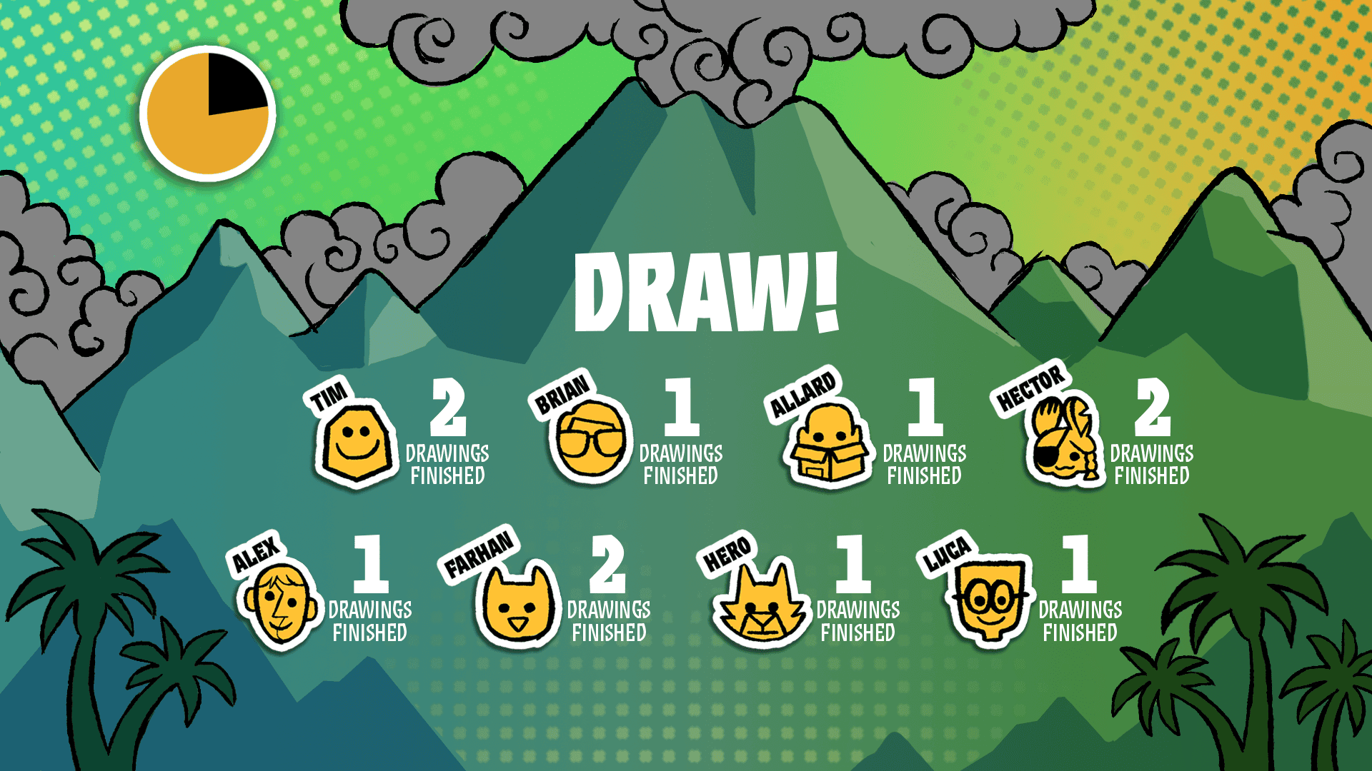
An early Tee K.O. 2 mockup by Hector Padilla.
What did you pull for inspiration when designing the look of the game?
Kyle Fleischer: A lot of my inspiration [for Dodo Re Mi] came from a mix of botanical illustrations and 60s jazz album covers. I wanted to find a way to make the screen layouts feel organic, and not too overbearing. I also really wanted to visualize the music in a way that matched the rest of the UI.
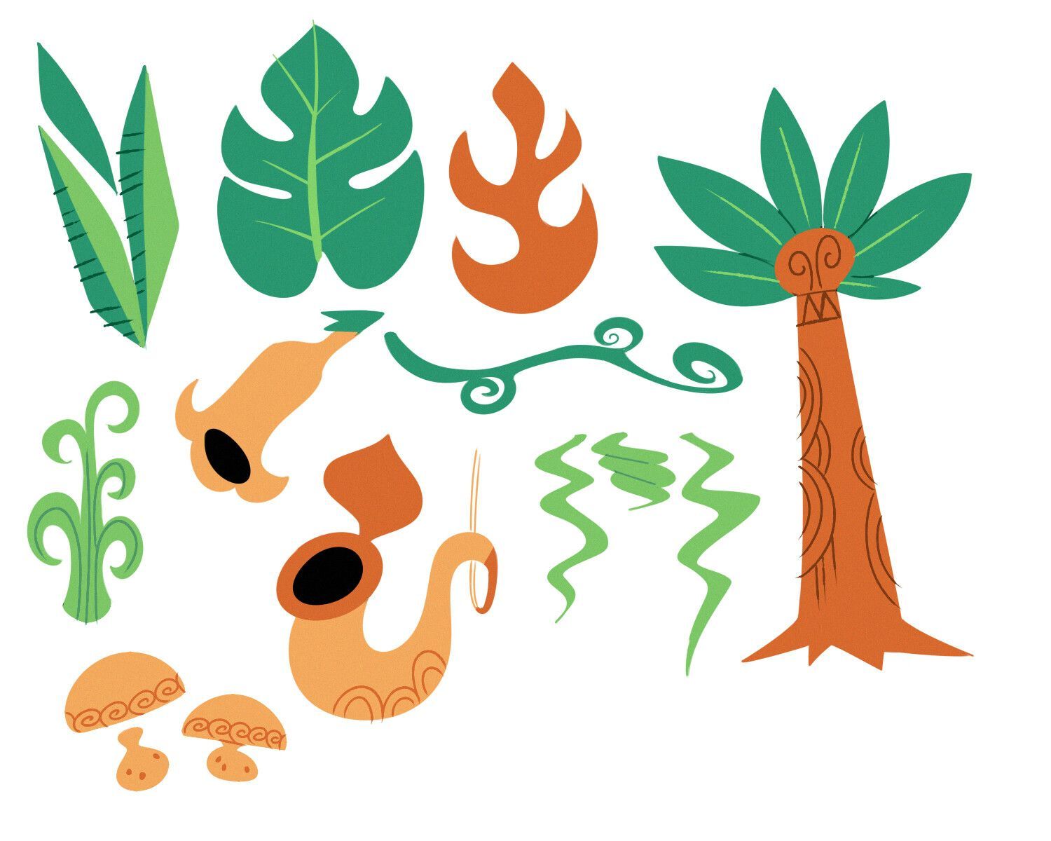
An early mockup of retro plants for Dodo Re Mi by Patrick deBardelaben.
Steff Egan: For [Timejinx], I was really inspired by the UPA style that had taken over PowerPuff Girls, Dexter's Lab, and other cartoons at the time. It's a fun blocky style that can convey busy backgrounds with simple shapes, which aligned perfectly with my vision of creating a busy but still welcoming science lab.
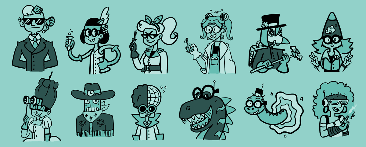
A rough sketch of early character designs for Timejinx by Steff Egan.
I wanted the backdrops to be visually engaging without being overly detailed or distracting from the characters and action. I also looked to fashion throughout the years as inspiration for the characters' designs, aiming to give each one a distinct look and personality that would pop against the lab backdrops.
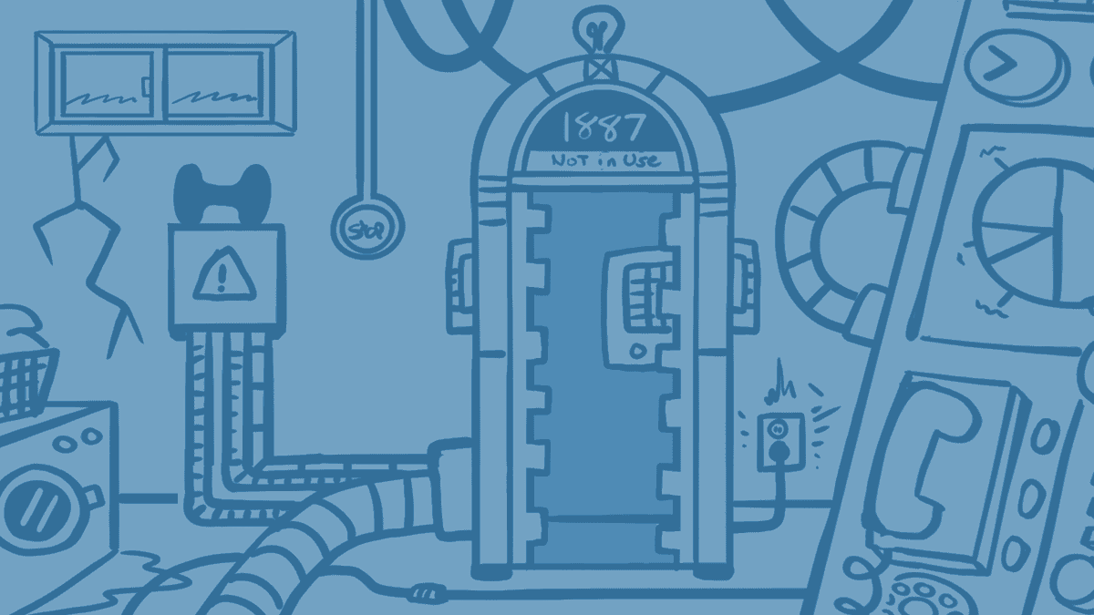
Early background designs for Timejinx.
Owen: [Hypnotorious’ look was inspired by] Billy & Mandy, Rocky & Bullwinkle, Ren & Stimpy, and strangely enough my father (he used to draw this weird brain creature with a foot when I was growing up).
How do you approach the look of the overall pack? How do you wrap five separate games into one cohesive package?
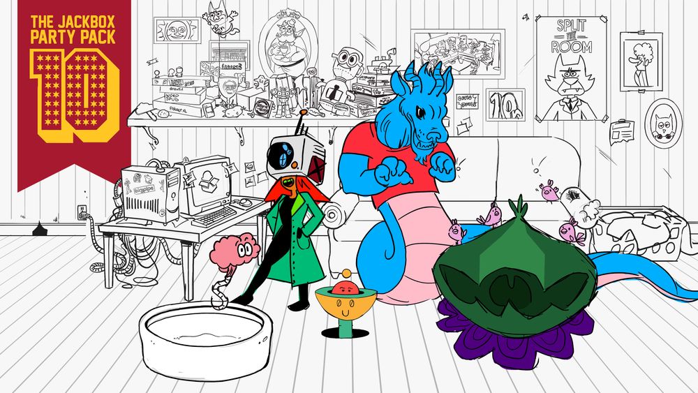
Hero Paul See: I believe the beauty of the overall pack is how different they can all be! It's always a joy to see the picker and see all of the characters "come together" in a shared space - in a fun college-inspired game room!
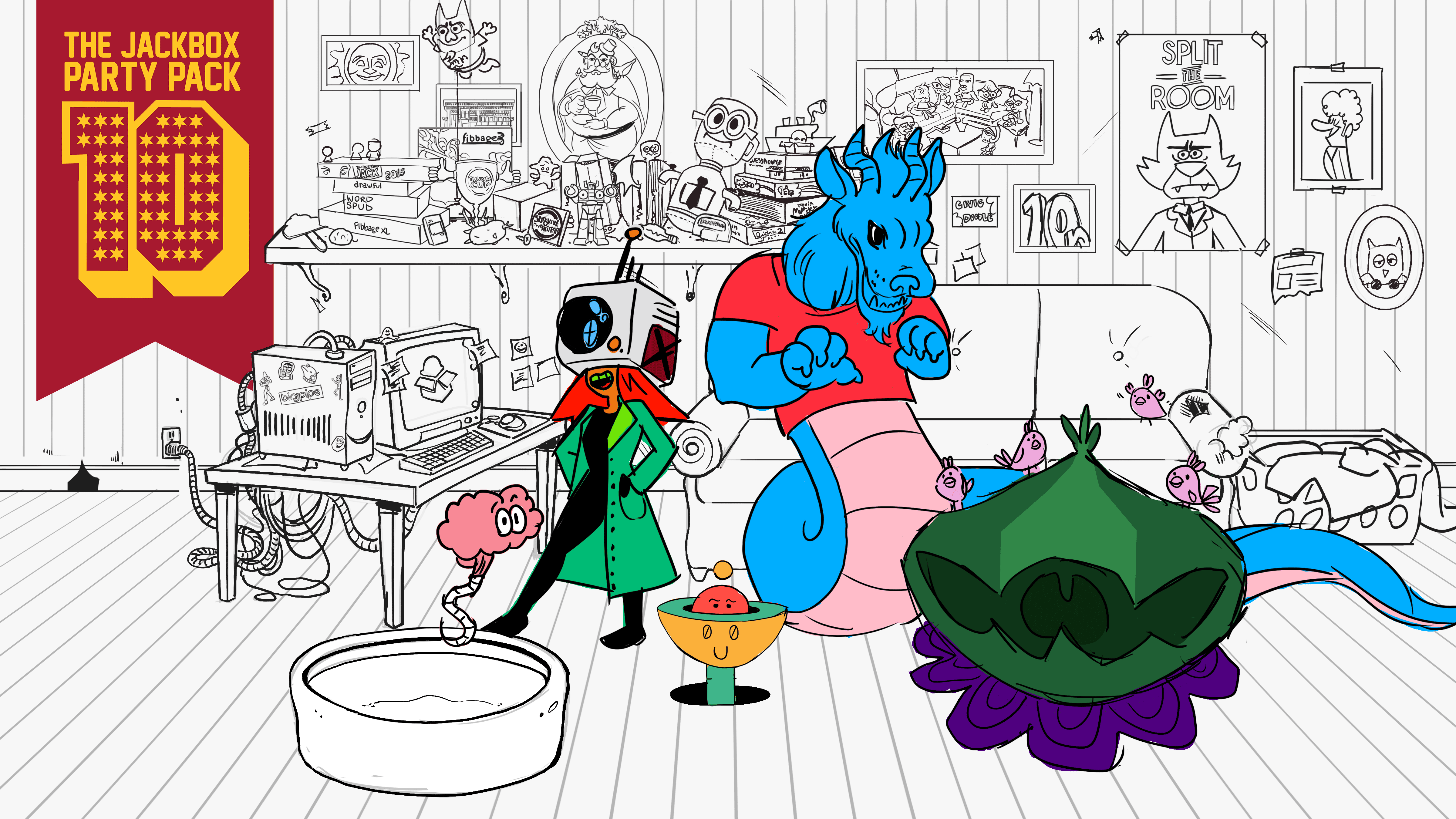
Early concept art for the picker. The picker was designed by Lev Cantoral and Charlie Bickett, with additional help from Bruno Rodríguez, Hero Paul See, and Nolan J. Downs.
Bruno Rodríguez: I think the games are consistent in some of the structure and the general UI but the art sets them apart instead of bringing them together. It creates contrast between the games and makes them more memorable. The main menu (the picker) is the mother, feeding the litter of five. She tries to set them up for success; but they are a handful, it's not an easy task.
How much do you talk with the other artists on the team and the Studio Art Lead when approaching the look of your individual game and the overall pack? Is each game made siloed and then brought together at the end or is there thought in how every game will look together from the start?
Kyle Fleischer: All the artists at Jackbox meet regularly to showcase the progress on each of their games. I think we all have pretty distinct styles, however at the start of a pack's production we do keep in mind the themes other games are using. There was a worry that Dodo and TKO2 might be too similar in environment, so with Dodo we pushed deeper into the jungle and did away with ever showing the sky.
Stef Egan: It'd be amazing if we knew what every game would look like from day 1 of production, however that is much easier said than done! From the first to last day of production it feels like the artists are constantly cooking, experimenting with new ideas and iterating on existing concepts. We do talk to each other and critique concepts, but you can't help it when random inspiration hits or a stray note from another team member asks to switch something up. The collaborative nature of game development means the art direction is always susceptible to shifts based on feedback or technical limitations. We make our games as best as we can with our team most of the time, but also remain flexible to capitalize on "happy accidents".
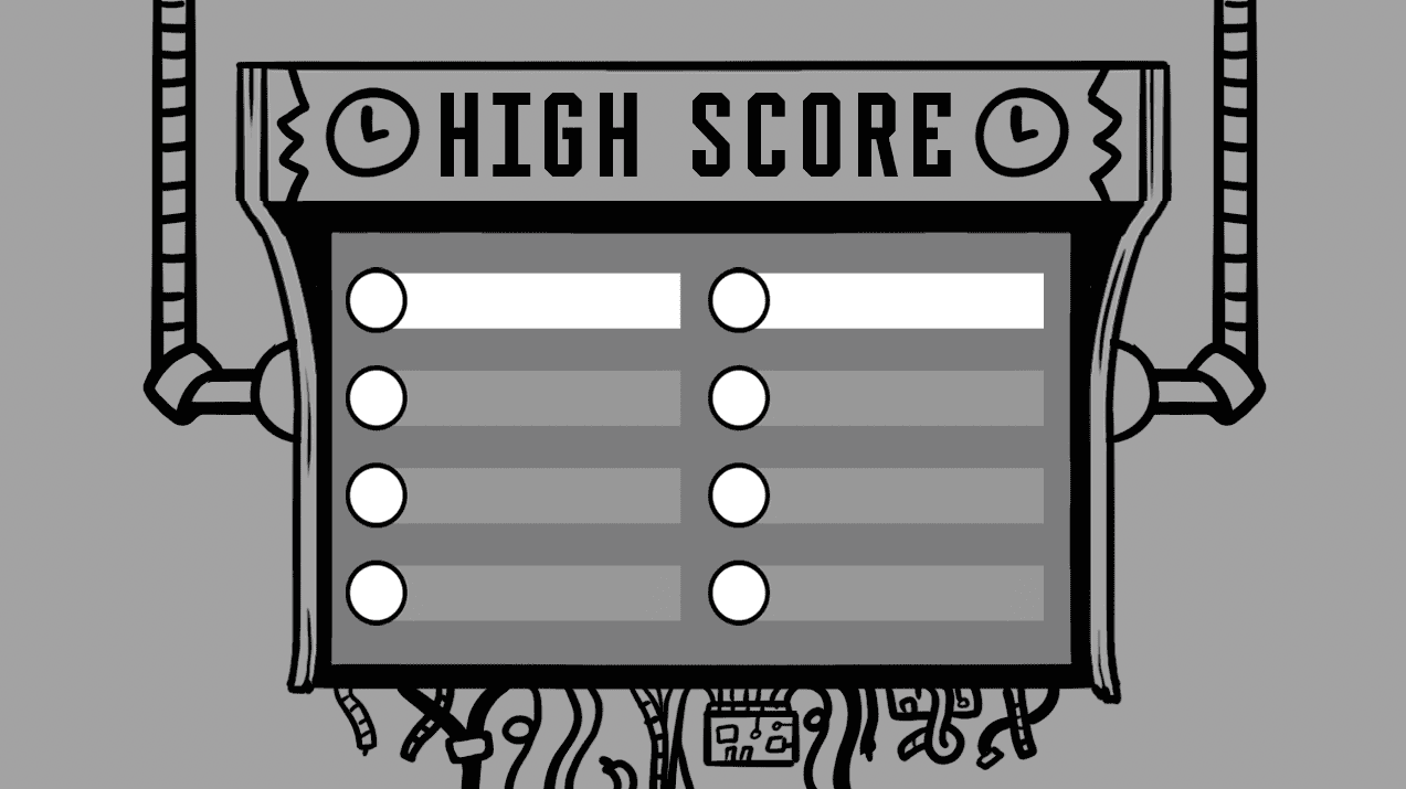
A rough sketch of the Timejinx scoreboard.
Hero Paul See: I make sure communication is open and clear with other artists and the Studio Art Lead! I am a big advocate for collaboration and managing scope since both are key in accomplishing art tasks - it's really easy to get lost in your own process! Daily check-ins and weekly art meetings are so helpful. For the most part, it seems most games are made siloed but made sure to have a variety for players from the start!
What are some of the biggest challenges when working on the design of a video game?
Owen Watson: Mostly time! As art leads, we are designing the game while the game design is still being developed!
Bruno Rodríguez: Making things clear, making a fun game loop, not over-complicating things. For art it's about how it compliments the other disciplines like music, writing and game design, and how it makes people feel. I have a background in graphic design so I'm always thinking how will people feel when they see this or that screen? What is the focal point? Is the hierarchy of elements making sense or is everything competing for attention and confusing the players? etc.
Hero Paul See: I believe some of the biggest challenges when working on the design of a video game is knowing when to pull back on a cool idea or cut content for the benefit of the project and well-being of the team!
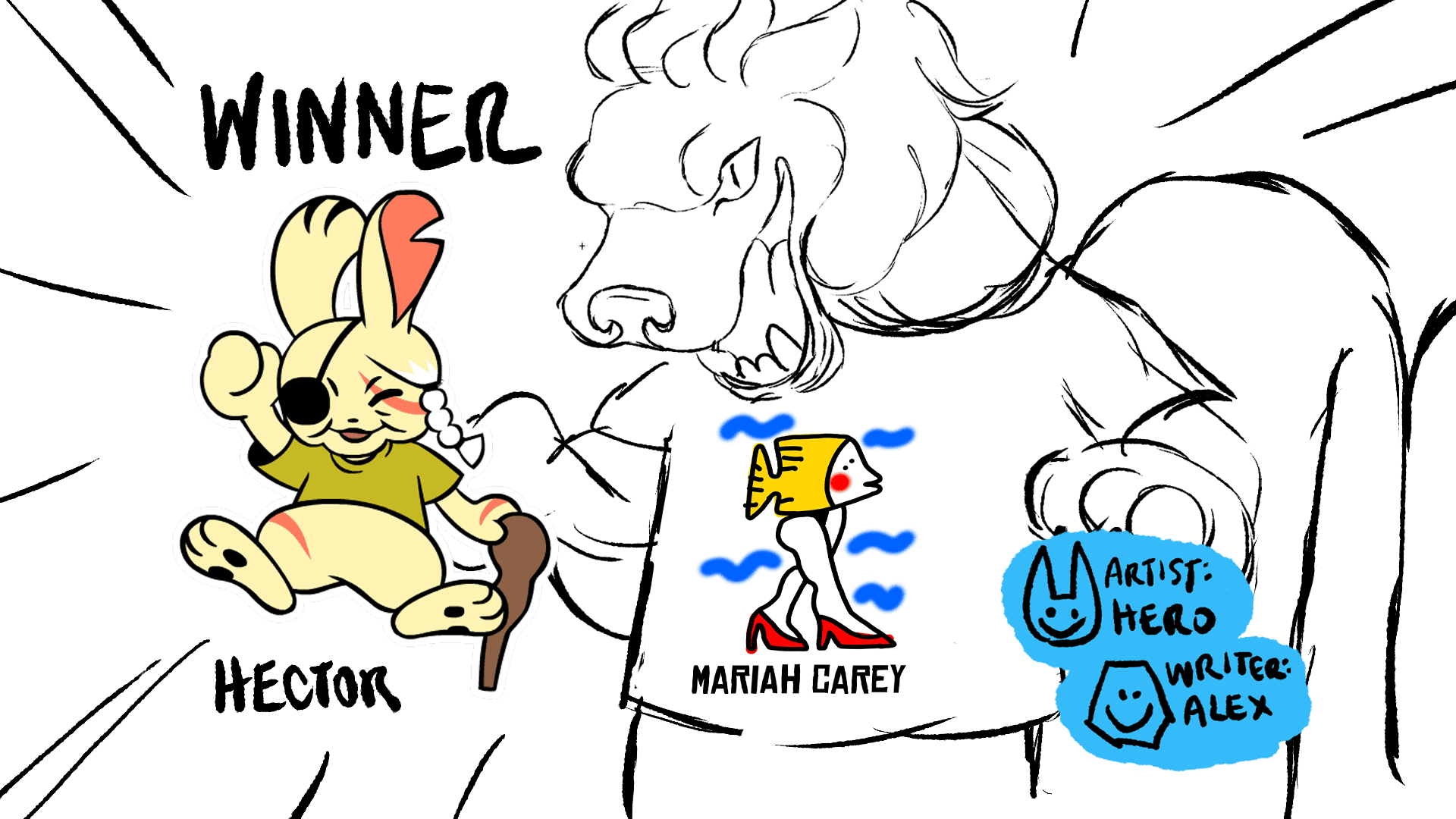
Some early Tee K.O. 2 concept art by Hector Padilla.
How did you get into making art for video games? What advice would you have for someone trying to start their career as an artist in the video game industry?
Kyle Fleischer: My first experience with making art for games was in a game jam with a few friends, which gave me a good sense of the technical side of game art. I've always enjoyed making weird art in a variety of styles, which ended up being a good fit for Party Pack games. I think it's good practice to intentionally put constraints on your art, and learn from how you adapt to them. That's often the situation you'll be in during a game's production.
Owen Watson: I went from working in TV animation to games, it just kinda happened because Jackbox was looking for someone with TV animation character experience- it certainly helped I used flash since I was a wee lad! My advice is to always make FRIENDS not connections. I can't tell you how many opportunities I got and gave others by making solid friendships.
Bruno Rodríguez: My advice is to take drawing classes or just practice a lot. Learn perspective and draw from real life. But more importantly I think you need good ideas to make good art. Don't just look at other art for inspiration: Read books on all sorts of subjects, talk to interesting people and be curious about the details of the world. How you produce images is just a small part of it. With games it helps knowing a thing or two about animation and programming, especially if you are in a small team.
Experimentation is your friend. make a giant pile of garbage and some pieces will shine when the moon is bright.
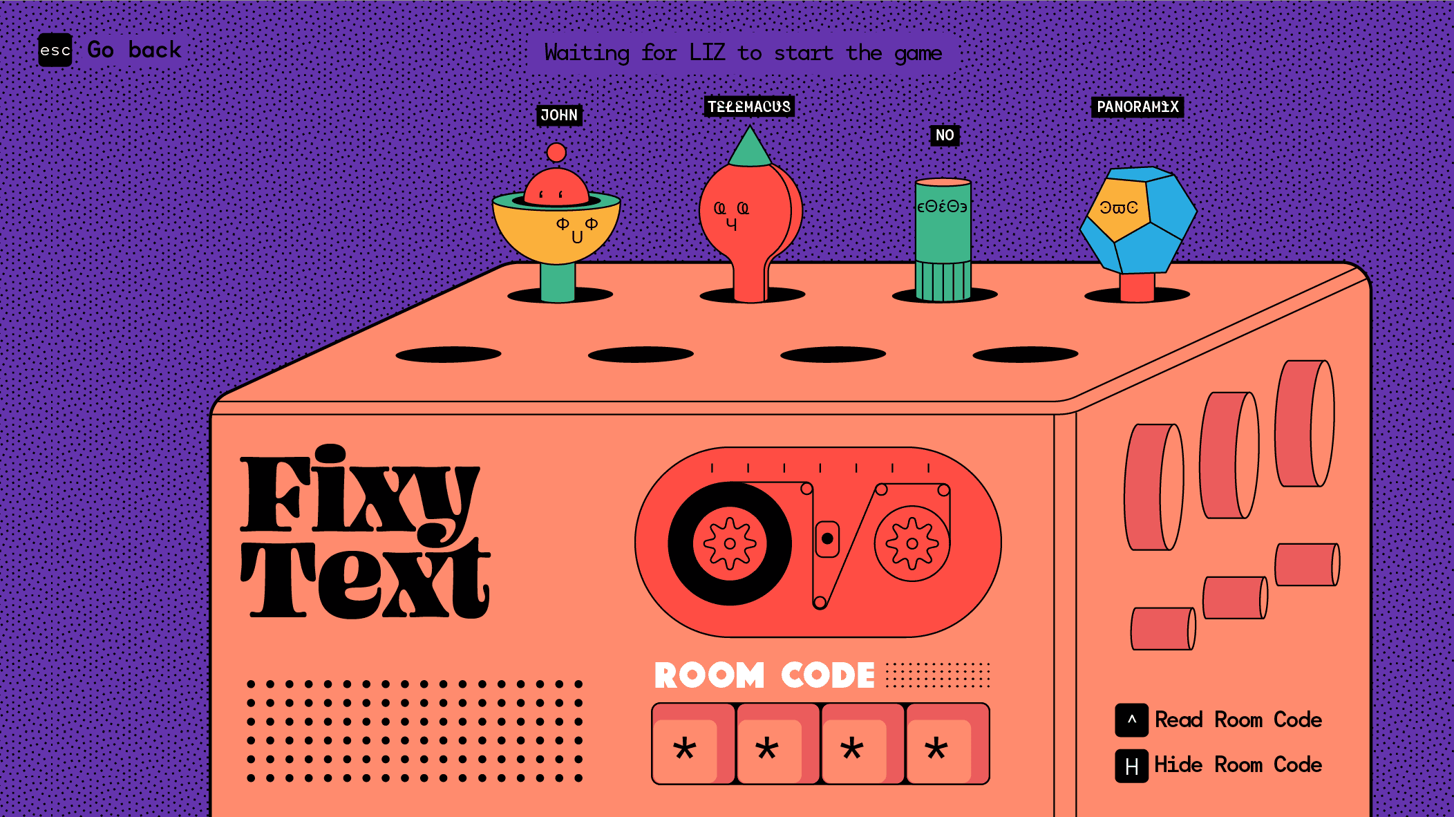
An early mock-up of the FixyText lobby by Bruno Rodríguez.
Are there any fun stories of memories from making Party Pack 10 that you're particularly fond of? Or anything else you feel should be included in the blog?
Kyle Fleischer: Every major milestone of Dodo was a joy. Whether it was Nate [Sandberg] dropping a new song in the dev chat, seeing Patrick [deBardelaben]'s bird designs fully animated, or hearing our playback accurately for the first time, it felt like we were discovering what this game is, step by step.
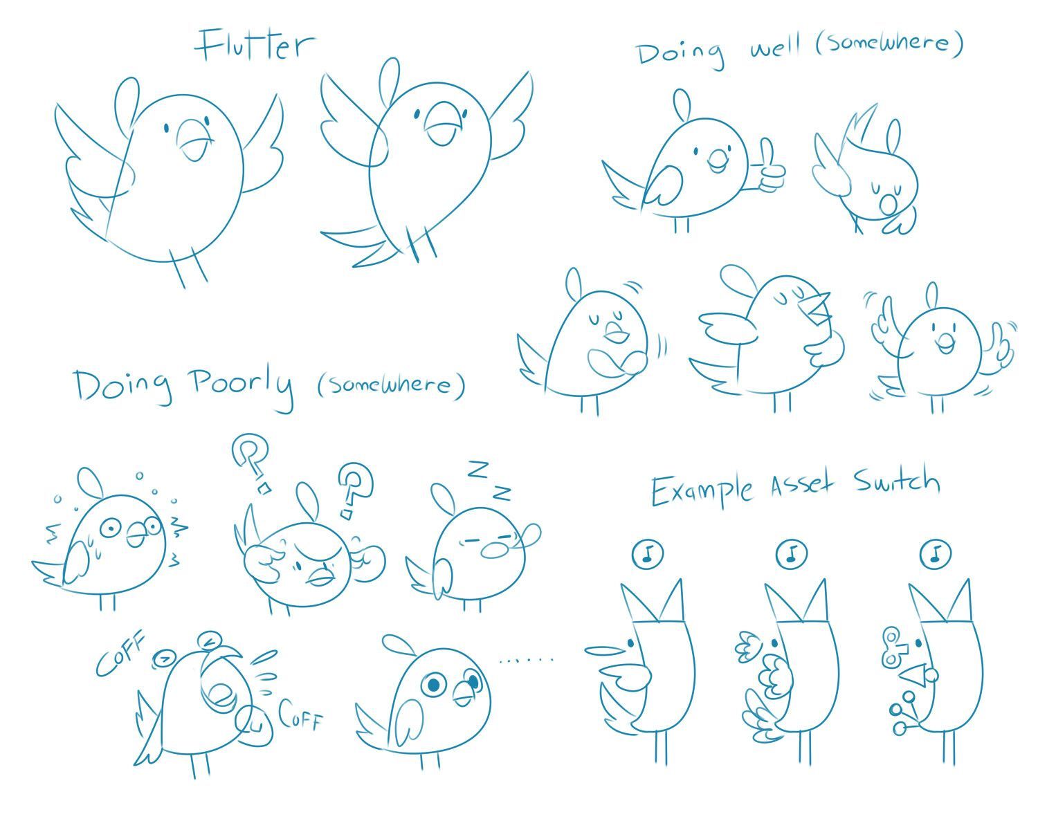
Patrick Patrick deBardelaben’s sketches of early bird poses for Dodo Re Mi.
Steff Egan: There have been jokes floating around the team about shipping the characters I've designed [for Timejinx] into romantic relationships. It's been fun for brainstorming but makes me want to start a dating sim spin-off. Make it happen, Mr. Box! Also as an anime fan, I can't resist sprinkling Easter eggs throughout my work when I get the chance. Can you spot them all amidst the character designs and backgrounds?

